Monday, March 11, 2019

Wait... Color Matters

Hey guys!

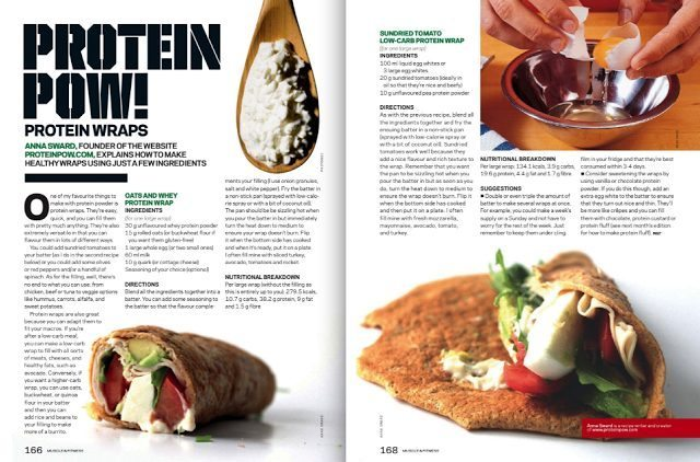
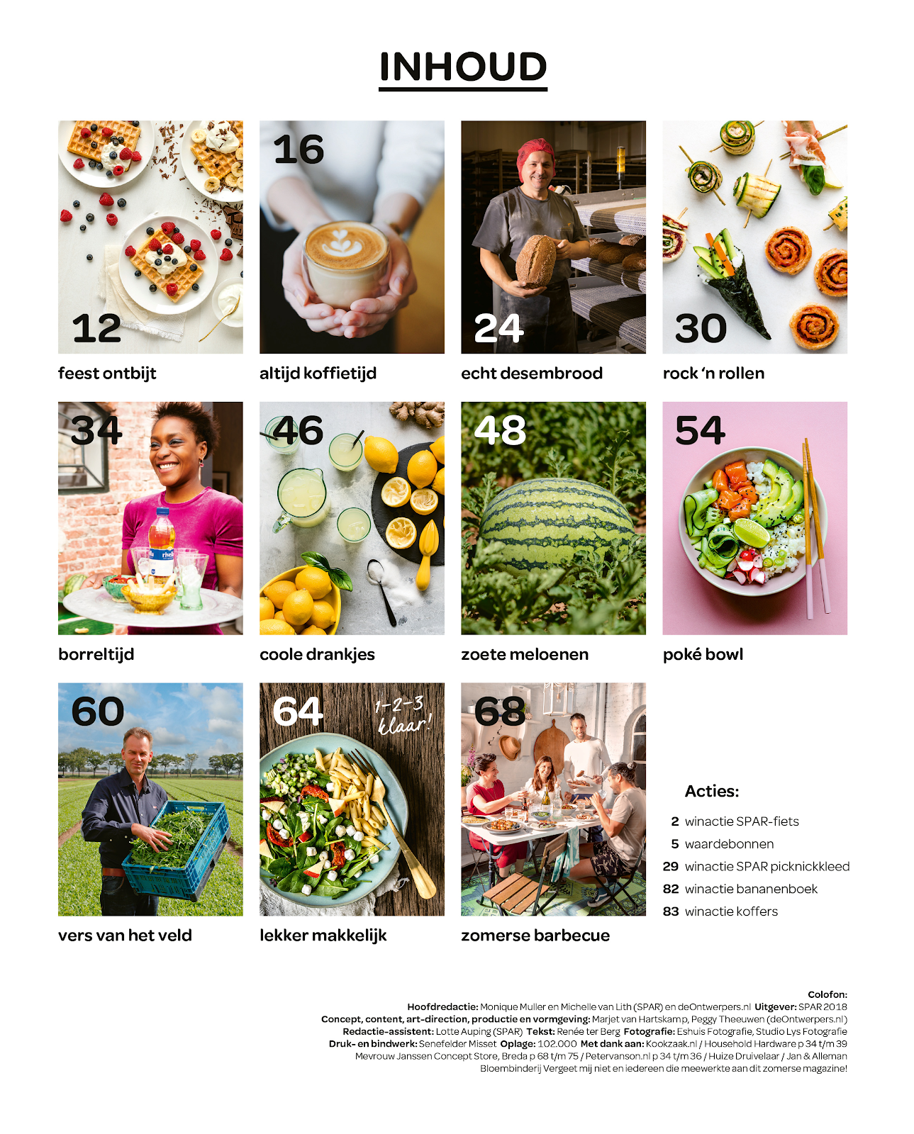
So while I was in the middle of creating my masthead, I noticed I need to find a color palette filled with colors that wont clash. I went on to Google and researched some color palettes that reminded me of healthy foods and here they are:


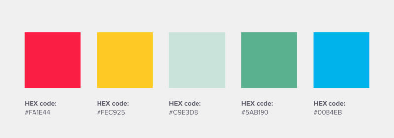
These color schemes are different but all do incorporate the overall same theme which is healthy foods. When you look at these colors they remind someone of fruits and vegetables which is the main source to eating healthy. I want to make my masthead a color that pops so when my specific audience sees the magazine they instantly want to pick it up and read it. I want to make sure the color of my masthead flows with the colors I use on my cover page. I think it is very important to include a variety of colors but make sure they mesh well. Usually when I first pick up a magazine, I notice the colors used which also gives me some sort of idea of what the magazine's tone is going to be  

These are some examples but I will keep looking for more! Look out for my next post where I will show you all which color scheme I choose and some ideas I have for my masthead!

Sunday, March 10, 2019

Official Double-Page Layout

Hey guys!

I have decided on what double-page layout I want to use. This will be the last component of planning the layout of my whole magazine and I finally will be able to start focusing on the design and content I want to include.

The double-page layout I have choice is going to look like this:

I think by using his layout, I will be able to organize my article in a neat way. I included arrows in my layout simply to show the way I plan to have my text flow. Inside the text boxes, I want to include maybe a quote or two to separate my text and make it easier on the eye. I want to make sure my text all lines up in a box like figure with all the text starting and ending in a line to create a straight edge. I want to make the title big and bold to grab the reader's attention when flipping through my magazine. I think including 3 pictures is the perfect amount because I want to give examples of the food creations to try and intrigue my reader to actually take the time and read the article. I also want to use bright colors and a simple white background. I will use a fun but simple font and black lettering.


Now that I have all my layouts for my magazine, I need to start designing the basic font, colors, and theme I want to include throughout my entire magazine. I want to keep it simple but at the same time intrigue people into checking out my magazine.


When I think of healthy foods I think of green and bright colors like red and blue. I want my magazine to reflect the colors of healthy foods like fruits and vegetables.

I am going to design some potential mastheads and logos and share my creations with you all in my next post so look out for it!

Friday, March 8, 2019

Double-Page Layout Ideas

Hey guys!

So I found some layouts I could potentially use as my double-page spread. Here they are:


These are just a few examples of some double-page layouts I think could fit well in m magazine. The main thing I want from my double-page spread is for my target audience to look at it and think it is well organized and not too much on their eyes. I want to make sure the pictures I include are vibrant and follow the article. I want the layout I use to be easy to follow and actually encourage my target audience to subscribe to my magazine and become loyal consumers. The examples above are similar but all different in their own way. They all include many pictures and a simple background but have a different format of how the text is presented and where exactly the pictures are placed. I’m not too sure if i want my pictures surrounding my article or actually inside it. I know I want to make the background a solid color to keep the simplistic aspect and to to insure that all the attention is on the text and pictures on the page.

I am going to do more research and ask some people in my target audience which double-page layout they prefer to see. Check back to see which layout I decide to use for my magazine.

Wednesday, March 6, 2019

Official Table of Contents Layout

Hey guys!

I have decided on what which table of contents I am going to do for my magazine. After asking some people who fall into my target audience which table of contents they would prefer, I decided to combine a few of the ideas I had into one. Here it is:


I feel like this table of contents layout will best fit the theme of my magazine because it is simple and still allows me to educate my target audience about what is inside my magazine. I plan to make the pictures on he side support certain articles that can be found inside my magazine. These pictures will be bright and appealing to entice my audience to turn to that page and check the article and recipe.

Now that I have a cover and table of contents layout, just need to design a double-page spread layout and then I will finally be able to actually start the design process which will include what pictures, fonts, colors, and information I want to include in my magazine.

I am going to research and design some double-page spread layouts and will show you what I find in my next post so look out for it!

Monday, March 4, 2019

Table of Contents Layout Design Ideas

 Hey guys!

I have been doing some research and wanted to share it with you all. As you know from my previous post, I am trying to design a table of contents layout for my my magazine Nutritious & Delicious.


These are some I found online that I thought could fit well in my magazine.


Here are some I designed based on what I researched.


The thing I like about all of these are that they all portray a simplistic aspect. They all have straight lines and are very well organized making them easy to read and navigate. One of my main goals with my table of contents is to make it easy for my audience to find what they are looking for.

I am going to review each layout again and ask some people that fall into my target audience which one they would prefer and share that information in my next blog post!

Sunday, March 3, 2019

Cover Design Ideas

Hey guys!

So I have decided on magazine cover layout! I have decided to do this one:

I feel like having this cover layout will help my reach my target market and organize all my stories seamlessly. I also want to make sure that the picture of the healthy dish is the center of attention and matches my cover story. I plan on making the magazine background white to portray a simple style and make the picture super colorful and bright. I also want to incorporate my magazine title design to the text of the stories I plan to include.  

When I think of healthy, I think of green so I want to possibly take a medium shade of green and place that as my magazine name. I also want the font to help support the simple aspect I am going for so I definitely want it to be straight, clear lines. I think by having a simple font it will help generate a simplistic idea through the target audiences minds. I want them to look at my magazine and think that the foods and recipes seem so simple and easy which I plan to make them all. 

Next I need to figure out a table of content layout designs. I will go research and design some layouts now and share with you all in the next post so look out for it! 

Friday, March 1, 2019

Cover Layout Ideas

Hey guys

So I finally finished cover layout ideas! Here they are:


So I am not too sure which one I want to use but those are some ideas. 

I wanted to make sure my cover appeals to my target audience. My target audience is going to be women ages 30 - 45, who enjoy a healthy diet for themselves or their family, and love to cook. I plan to make my recipes easy, fun, and healthy. I believe that moms could be a huge audience for my magazine because they like to provide healthy and exciting foods to their family. 


Check back for my next post where I will be revealing my cover layout and the stories I plan to feature! 


CCR!

Hey guys! Wow we have come a long way. I wanted to thank you all for coming along with me on this journey and I am so excited for you al...