I have decided on what double-page layout I want to use. This will be the last component of planning the layout of my whole magazine and I finally will be able to start focusing on the design and content I want to include.
The double-page layout I have choice is going to look like this:
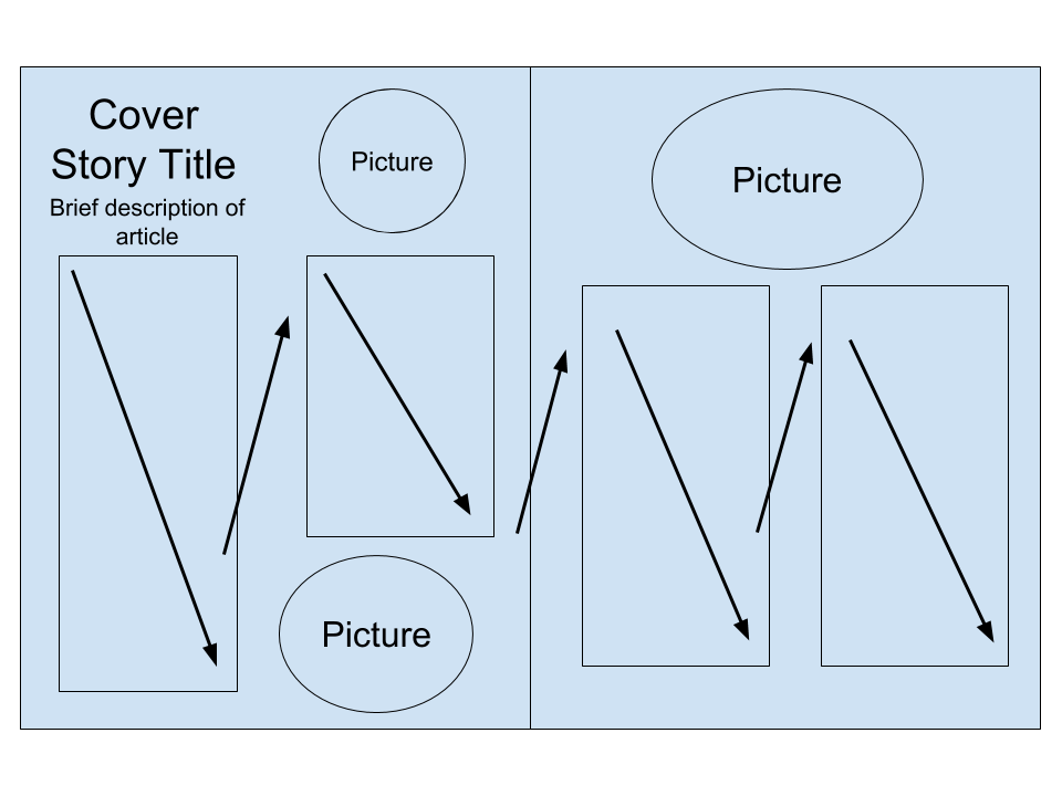
I think by using his layout, I will be able to organize my article in a neat way. I included arrows in my layout simply to show the way I plan to have my text flow. Inside the text boxes, I want to include maybe a quote or two to separate my text and make it easier on the eye. I want to make sure my text all lines up in a box like figure with all the text starting and ending in a line to create a straight edge. I want to make the title big and bold to grab the reader's attention when flipping through my magazine. I think including 3 pictures is the perfect amount because I want to give examples of the food creations to try and intrigue my reader to actually take the time and read the article. I also want to use bright colors and a simple white background. I will use a fun but simple font and black lettering.
Now that I have all my layouts for my magazine, I need to start designing the basic font, colors, and theme I want to include throughout my entire magazine. I want to keep it simple but at the same time intrigue people into checking out my magazine.
When I think of healthy foods I think of green and bright colors like red and blue. I want my magazine to reflect the colors of healthy foods like fruits and vegetables.
I am going to design some potential mastheads and logos and share my creations with you all in my next post so look out for it!


No comments:
Post a Comment