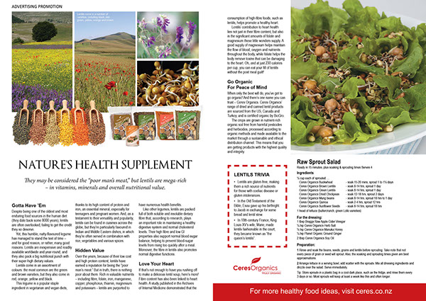
So I found some layouts I could potentially use as my double-page spread. Here they are:

These are just a few examples of some double-page layouts I think could fit well in m magazine. The main thing I want from my double-page spread is for my target audience to look at it and think it is well organized and not too much on their eyes. I want to make sure the pictures I include are vibrant and follow the article. I want the layout I use to be easy to follow and actually encourage my target audience to subscribe to my magazine and become loyal consumers. The examples above are similar but all different in their own way. They all include many pictures and a simple background but have a different format of how the text is presented and where exactly the pictures are placed. I’m not too sure if i want my pictures surrounding my article or actually inside it. I know I want to make the background a solid color to keep the simplistic aspect and to to insure that all the attention is on the text and pictures on the page.
I am going to do more research and ask some people in my target audience which double-page layout they prefer to see. Check back to see which layout I decide to use for my magazine.
No comments:
Post a Comment